
NBA City Edition jerseys have changed how fans understand team identity, league marketing, and basketball style, because today an NBA team no longer appears in just a home white and a road color. Instead, franchises rotate through several uniforms each season, with City Edition designs often generating the most debate, the fastest sellouts, and the clearest statement about how a team wants to present itself. In practical terms, a City Edition jersey is a special annual uniform intended to reflect a local story, cultural symbol, historic reference, or community theme connected to the franchise’s market. To explain why teams now wear multiple uniforms per season, you have to look at the NBA’s partnership with Nike, the league’s shift away from fixed home-and-away conventions, the commercial value of constant product refreshes, and the way modern sports branding works across television, social media, and streetwear.
I have followed jersey launches, retail cycles, and on-court branding changes for years, and the pattern is consistent: uniforms are no longer just equipment. They are content, merchandise, nostalgia vehicles, and city-marketing tools at the same time. That matters because gear sits at the center of NBA culture. A jersey can honor a neighborhood, revive a 1990s logo, reference local architecture, or connect a team to its fan base in a way a press release never could. It also affects how casual viewers recognize a franchise, how collectors buy apparel, and how teams tell stories about themselves. For a hub page on NBA gear and style, City Edition jerseys are the right starting point because they sit at the intersection of design, business, fandom, and identity.
Key terms help frame the subject. The NBA’s current uniform system generally includes Association, Icon, Statement, and City Edition sets, with some teams also receiving Classic Edition uniforms in select seasons. Association uniforms function as the light base look, Icon uniforms are the primary team-color version, Statement uniforms are bolder alternates, and City Edition uniforms are the annual concept-driven designs tied to place. Classic Editions revisit earlier eras. Since Nike became the league’s outfitter in 2017, this category structure replaced the older, simpler home-road-alternate model. The result is a more flexible system in which teams can wear different uniforms depending on marketing plans, storylines, special games, and court design coordination.
For fans asking the basic question, the short answer is simple: teams wear multiple uniforms because the NBA discovered that more design variation creates more revenue, more local storytelling, and more digital attention without changing the sport itself. The longer answer is more interesting, and it explains why a City Edition launch can feel almost as significant as a trade deadline move in some markets.
How the NBA uniform system changed
For decades, NBA uniforms followed a convention most fans understood instinctively: white at home, darker colors on the road, plus occasional alternates. That system was easy to follow but restrictive from a branding perspective. When Nike replaced Adidas as the NBA’s uniform supplier beginning with the 2017-18 season, the league moved to a more modular uniform framework. The home-and-away labels disappeared, opening the door for teams to wear a wider range of designs regardless of location. This was not a cosmetic tweak. It changed scheduling, merchandising, and the way each game could be packaged visually.
The Nike era also aligned uniforms with broader apparel strategy. Nike has long treated sportswear as both performance gear and lifestyle product, and the NBA fit that approach perfectly. Basketball jerseys are worn in arenas, on city streets, in music videos, and across social platforms. By giving each franchise multiple official looks, the league created recurring annual product drops rather than a mostly static inventory. In retail terms, that means repeat purchase opportunities. In cultural terms, it means a team can present itself differently to different audiences without abandoning its core brand.
One useful example is the Miami Heat’s “Vice” family of designs, which expanded beyond a single successful alternate into a sustained visual identity associated with neon colors and South Florida nightlife. Another is the Phoenix Suns’ “The Valley” City Edition jersey, which connected directly with fans through a simple but distinctive desert-and-sunset concept. Those uniforms were not random experiments. They showed teams that a well-executed alternate can become emotionally resonant, commercially successful, and instantly recognizable on broadcasts.
What makes a City Edition jersey different
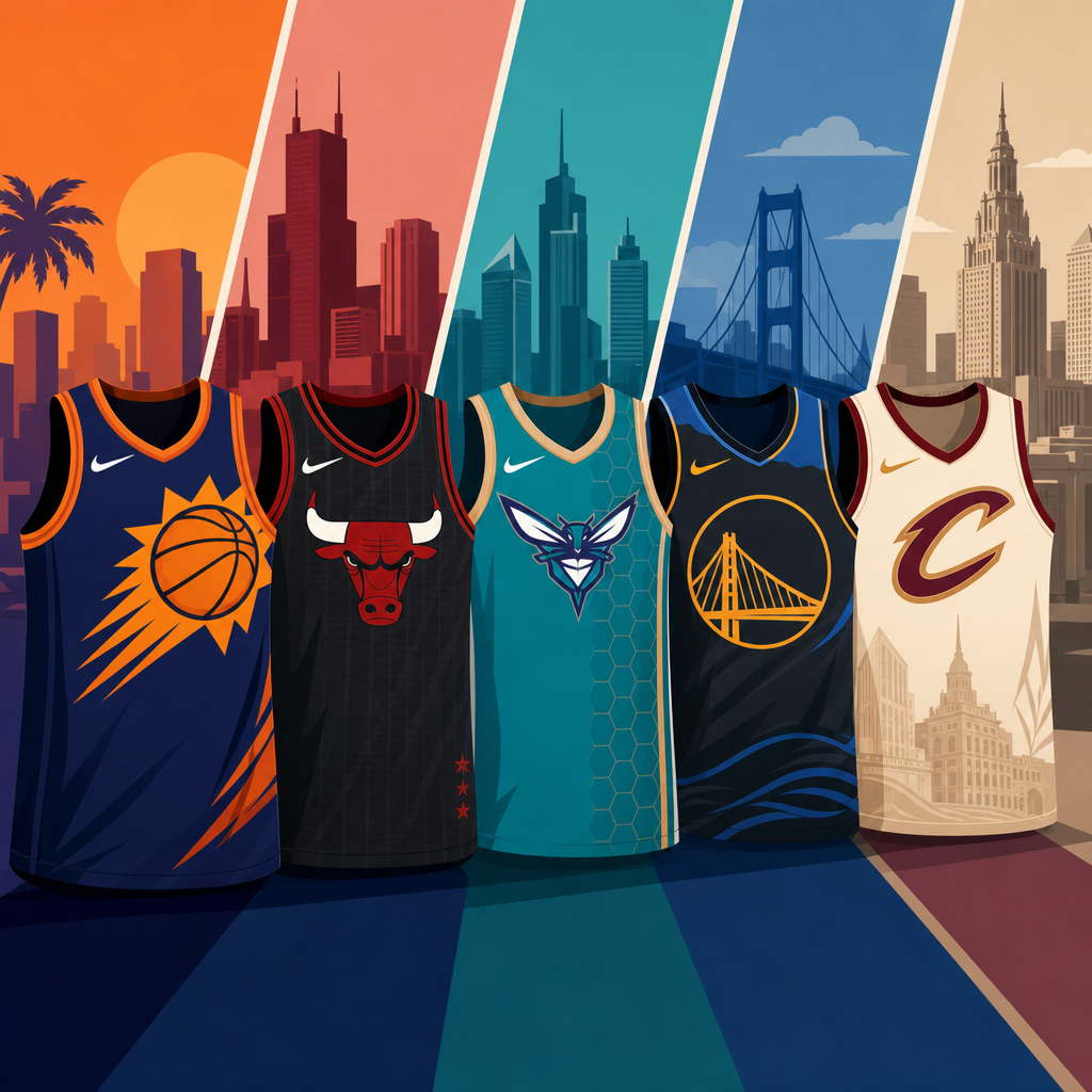
A City Edition jersey is supposed to do one job above all others: translate a local story into a wearable team identity. Sometimes that story is historical, such as a design referencing a franchise’s origin era, municipal flag, transit map, or championship anniversary. Sometimes it is geographic, using mountains, skylines, rivers, desert palettes, or neighborhood shorthand. Sometimes it is social, honoring civic movements, community groups, or the cultural contributions of local musicians and artists. The strongest City Edition uniforms feel specific enough that residents immediately understand the reference, while still looking clean enough for national audiences and retail shelves.
In practice, execution varies. Some teams produce sharp, coherent designs grounded in authentic symbols. Others over-explain weak concepts that fans read as generic. I have seen launches where the storytelling video was better than the jersey itself, and fans noticed. A successful City Edition needs three things working together: a real local connection, a readable on-court design, and a colorway that does not fight the franchise’s established identity. If any of those elements fail, the jersey may trend for the wrong reasons.
Consider the Chicago Bulls, one of the hardest teams to redesign effectively because their core visual system is already iconic. A City Edition concept has to respect that red-black-white foundation or risk looking disconnected from the brand. By contrast, a team like the Utah Jazz has had more room to experiment across eras, from mountain motifs to high-contrast modern palettes. The challenge is not simply making something new; it is making something new that still looks unmistakably tied to the team.
Why teams now wear multiple uniforms per season
The biggest driver is revenue. New jerseys create new merchandise cycles, and limited-time designs encourage urgency. Fans who already own a standard jersey may still buy a City Edition because it tells a different story or feels more collectible. Teams and the league benefit from that repeat demand, while Nike gains a steady stream of annual releases that can be promoted like sneaker drops. The business case is obvious: one team identity can support several products instead of one or two.
The second driver is content. Every uniform reveal creates photography, social posts, player reaction videos, local media coverage, and discussion among fans. In a league that thrives on year-round conversation, jerseys are not minor assets. They are engagement tools. A City Edition launch can dominate a news cycle in October or November, especially if the design references a beloved era or a polarizing civic symbol. That visibility matters because the NBA competes not only with other leagues but with the nonstop entertainment economy.
The third driver is strategic branding. Multiple uniforms let teams segment their image. A franchise can preserve a classic primary identity while using City Edition nights to highlight local culture, younger audiences, or a different aesthetic sensibility. The court, warmups, in-arena graphics, and retail activations can all align around that temporary look. When done well, it feels like a themed event rather than a simple wardrobe change.
| Uniform type | Main purpose | Typical design approach | Example of fan appeal |
|---|---|---|---|
| Association | Core team identity | Light base colors, standard marks | Traditional look for everyday wear |
| Icon | Primary color expression | Franchise colors and standard branding | Best choice for team-color loyalists |
| Statement | Bolder alternate branding | High-contrast or aggressive styling | Appeals to fans who want a sharper variant |
| City Edition | Local storytelling and annual refresh | Place-based symbols, historic references, special palettes | Strongest draw for collectors and hype buyers |
| Classic Edition | Nostalgia and heritage | Throwback logos, fonts, and colors | Connects older eras to current rosters |
The business of jerseys, drops, and retail demand
City Edition jerseys make sense when viewed through the economics of licensed sports apparel. The NBA is a global league with a young fan base, strong player-driven marketing, and unusual overlap with fashion and music. That combination makes jersey inventory more dynamic than in many other sports. A baseball team can sell tradition. The NBA can sell tradition, trend, and player style at the same time. Retailers know that a fresh jersey tied to a star player, a playoff run, or a compelling local concept can outperform a standard release.
Scarcity also plays a role. Even when a City Edition is not technically ultra-limited, it often feels time-bound because it belongs to a single season. Fans understand that if they pass now, the design may disappear or rise in resale value later. That psychology increases conversion. It is the same logic that powers sneaker culture, and the NBA has borrowed from that world effectively. The league’s partnership with Nike made that overlap stronger, especially when player tunnel fashion and team merchandise began to influence one another more visibly.
There is a risk, however, in overproduction. When every season brings another wave of alternates, some fans feel fatigue. I have seen collectors become more selective because not every design justifies the price, and authentic jerseys are expensive. Teams that release weak concepts too often can train their audience to wait for discounts instead of buying on launch. In other words, more uniforms can create more revenue, but only if the design quality and story quality stay credible.
How City Edition designs shape NBA culture and style
City Edition jerseys matter beyond the scoreboard because the NBA is the league where uniforms most often cross into everyday fashion. Basketball jerseys have long been part of hip-hop style, summer streetwear, and youth sports culture. A successful design can live outside the arena in a way an NFL or MLB jersey often does not. That is one reason the visual stakes are so high. Teams are not merely dressing players; they are trying to create a garment that works with jeans, shorts, varsity jackets, and sneaker rotations.
Some City Editions succeed because they look like clothing first and sports branding second. The black-and-gold Brooklyn Nets “Bed-Stuy” references, for example, tapped into borough pride and a clean palette that translated naturally to streetwear. The Denver Nuggets have repeatedly benefited from the enduring popularity of their mountain skyline motif, which reads clearly on television and looks strong in casual wear. The best NBA gear and style decisions understand this dual life: on-court performance and off-court desirability.
This is also why typography, trim details, and color blocking matter so much. Small choices determine whether a jersey feels premium or gimmicky. Gradient effects can date quickly. Oversized hidden meanings usually fail because fans respond first to silhouette and readability. The most durable uniforms tend to be the ones that communicate their idea immediately. If a viewer needs a long explainer to understand the concept, the design probably is not doing enough work on its own.
Why some fans love them and others hate them
Supporters of City Edition jerseys like the novelty, local references, and collector appeal. For many fans, especially younger ones, multiple uniforms make the season more visually interesting. They enjoy seeing a team reinterpret itself and appreciate when forgotten history returns to the floor. Fans in cities with strong civic identity often take pride in symbols that outsiders may overlook, whether that means a subway token motif, a state outline, or colors borrowed from a city flag.
Critics usually raise three valid objections. First, too many uniforms can weaken brand consistency. If a team appears in dramatically different colors too often, casual viewers may lose a clear sense of what the franchise looks like. Second, some concepts feel forced, as if a marketing department searched for symbolism after approving the artwork. Third, scheduling can be confusing when both teams wear nontraditional colors, especially for older fans used to the home-road distinction. Those complaints are not nostalgia alone; they point to the real tradeoff between creativity and clarity.
The NBA has not always balanced that tradeoff perfectly. Some seasons have included memorable hits and undeniable misses. Yet the league keeps investing in City Edition programs because even the debate proves their value. People discuss them, rank them, buy them, and complain about them. In media terms, that means they matter.
How to evaluate an NBA jersey as a fan or collector
If you are deciding whether a City Edition jersey is worth buying, start with authenticity of concept. Ask what local story it tells and whether that story is genuinely connected to the city or franchise. Then assess visual clarity: can you identify the team quickly, and does the wordmark or number set read well from distance? Next consider longevity. Some jerseys are excellent for one season but feel locked to a narrow trend. Others have the structure to become future classics. Finally, look at player association. A design worn during a playoff run or by a beloved star often gains long-term significance.
For collectors, version matters too. Swingman jerseys are more affordable and practical for everyday wear, while authentic editions use materials and cuts closer to what players wear on court. Check sizing carefully, inspect heat-applied graphics, and buy from reputable retailers because counterfeits remain common. If the goal is style rather than collection value, choose the colorway you will actually wear. The best jersey is not always the rarest one; it is the one that still feels right after the season’s hype fades.
City Edition jerseys explain modern NBA culture better than almost any other piece of gear because they show how the league now operates at once as a sport, a fashion engine, and a storytelling platform. Teams wear multiple uniforms per season because those uniforms generate merchandise sales, strengthen local branding, create social-media moments, and give franchises more ways to connect players with place. The strongest designs succeed when they are specific, readable, and rooted in something real, not when they chase novelty for its own sake.
For anyone exploring NBA gear and style, this is the hub concept to understand first. Once you grasp how Association, Icon, Statement, City Edition, and Classic uniforms function, the rest of the category makes more sense, from sneaker pairing and tunnel fits to throwback collecting and fan shopping strategy. A jersey is never just a jersey in today’s NBA. It is a visual argument about who a team is, who it wants to reach, and what part of the city it wants to represent.
If you want to follow NBA culture more closely, start paying attention to uniform release calendars, the stories teams tell about each design, and which jerseys fans continue wearing long after a season ends. That is where you can separate a temporary marketing drop from a true cultural hit.
Frequently Asked Questions
What is an NBA City Edition jersey, and how is it different from a team’s regular uniform?
An NBA City Edition jersey is a special alternate uniform created to highlight a specific part of a franchise’s identity, usually tied to local culture, history, community symbolism, architecture, music, state pride, or a defining era of the team. Unlike a standard primary uniform, which is meant to be recognizable year after year, the City Edition is designed as a storytelling piece. It gives teams a chance to say something more specific and more emotional about who they are and where they play.
That is the key difference. A team’s core uniforms are built around consistency and brand recognition, while the City Edition is built around variation and theme. In the past, fans mostly thought in simple terms: a home white jersey and a road color. Today, that model has been replaced by a broader uniform system that includes Association, Icon, Statement, and City Edition sets, with some teams also using Classic Edition uniforms in certain seasons. The City Edition stands out because it changes most often and usually carries the strongest narrative message.
In practical terms, these jerseys can feature unusual color palettes, alternate wordmarks, local nicknames, commemorative details, and graphic references that would not necessarily fit on a team’s standard uniform. Some designs become instant favorites because they feel authentic and visually fresh. Others generate criticism if fans believe the connection to the city or franchise is too vague, forced, or overly commercial. That reaction is part of why City Editions get so much attention: they are not just uniforms, but public statements about identity.
Why do NBA teams now wear multiple uniforms per season instead of just home and away jerseys?
The NBA moved away from the old home-and-away model because the league, teams, and apparel partners realized uniforms could do more than identify one side from the other. Multiple uniforms allow franchises to market different aspects of their identity, connect with more segments of their fan base, and create new merchandise opportunities throughout the season. In other words, today’s jersey strategy is part branding, part storytelling, and part business.
Historically, the home white and road color setup was simple and easy to follow, but it also limited design flexibility. As sports branding evolved, teams across major leagues began treating uniforms as a wider visual system rather than a fixed pair of jerseys. The NBA embraced that shift aggressively. Under the current structure, teams can rotate through several looks depending on the opponent, the event, the schedule, and the message they want to emphasize. This lets a franchise celebrate local heritage one night, honor a past era another night, and maintain its standard identity the rest of the time.
There is also a modern entertainment component to this change. The NBA is not just a sports league; it is a global media product built on visuals, stars, and style. Distinct uniforms help create memorable broadcasts, social media moments, and retail demand. Fans notice when a team unveils a bold City Edition design or wears a rare alternate on a nationally televised game. The result is a league where uniforms are no longer static background elements. They are active tools for engagement, promotion, and cultural relevance.
What do City Edition jerseys represent for a team and its fans?
At their best, City Edition jerseys represent a bridge between basketball and place. They are meant to translate a city’s personality into a uniform, whether that means honoring a neighborhood tradition, referencing a local landmark, using regional colors, or reviving a phrase that resonates with the fan base. For teams, that makes the jersey a branding device with deeper emotional value. For fans, it can feel like a wearable expression of civic pride rather than just standard team merchandise.
This is why the strongest City Edition designs usually do more than look different. They tell a story that people immediately recognize. A successful jersey often works because fans can explain it in a sentence: it honors the city skyline, it references the local music scene, it revives a beloved era, or it celebrates a cultural symbol that matters to the community. When the concept is clear and authentic, the design can strengthen the bond between the team and its supporters.
At the same time, City Editions also reveal the tension built into modern sports branding. Fans want creativity, but they also want sincerity. If a design feels disconnected from the city, too reliant on vague branding language, or visually unrelated to the franchise, the reaction can be harsh. That debate is part of the phenomenon. City Edition jerseys matter because they sit at the intersection of identity, aesthetics, nostalgia, and commerce. They show how a team wants to be seen, but they also test whether fans agree with that vision.
Why do some NBA City Edition jerseys sell out so quickly and create so much debate?
City Edition jerseys tend to sell out fast because they combine scarcity, novelty, and emotional appeal. Unlike primary uniforms that remain familiar over longer periods, City Editions are seasonal and often perceived as limited-time products. Fans know a design may only be worn for one season or may not return in the same form again, which creates urgency. If the concept resonates, demand spikes quickly from collectors, die-hard local fans, and casual buyers who simply like the look.
The debate comes from the same source: these jerseys are expected to mean something. People are not just evaluating color combinations and fonts. They are asking whether the team captured the city correctly, honored its history respectfully, and made a design choice that feels true to the franchise. That raises the stakes. A standard uniform tweak might pass quietly, but a City Edition release invites immediate analysis from fans, designers, media members, and rival audiences.
Social media intensifies both the popularity and the criticism. The moment a new jersey drops, it is judged through photos, highlight edits, leaked images, and reaction posts. A strong design can become a viral success and drive immediate purchases. A weak one can be mocked before players ever wear it on the court. That speed of reaction helps explain why City Editions have become one of the most visible parts of the NBA’s modern image. They are annual visual events, and in a league driven by attention, that makes them incredibly influential.
Are City Edition jerseys good for the NBA, or have multiple uniforms made team identity more confusing?
Both arguments have some truth, which is why this topic remains so interesting. On the positive side, City Edition jerseys have unquestionably expanded the creative range of NBA branding. They allow teams to honor local stories, reach younger fans, refresh retail interest, and keep the league visually dynamic. For many franchises, these uniforms have produced some of the most memorable looks of the modern era. They also reflect how fans now engage with sports: not just through wins and losses, but through design, culture, and personal style.
On the other hand, frequent uniform changes can make team identity feel less stable. When a franchise wears several different colors and concepts in one season, casual viewers may not always associate the team with one clear visual standard. That was much easier in the older system, where a team’s look was more fixed and predictable. Critics argue that too much variation can weaken brand clarity, especially when a City Edition design strays far from traditional colors or logos.
The fairest conclusion is that multiple uniforms are good for the NBA when they are grounded in a coherent identity. Variety works best when the alternates still connect clearly to the franchise and the city. In that scenario, City Editions enrich a team’s brand rather than dilute it. Problems usually arise when a design feels random or disconnected. So the issue is not simply whether teams wear multiple uniforms per season. It is whether each uniform, especially the City Edition, adds meaning instead of just adding another product to the rotation.