

NBA logos do more than decorate jerseys and courts; they encode franchise identity, local culture, commercial strategy, and league history in a single mark. Ranking every NBA team logo means judging visual clarity, symbolism, longevity, and how well each design survives across uniforms, broadcasts, merchandise, and digital screens. In practice, the best marks feel instantly recognizable at a glance, still reveal detail when examined closely, and remain flexible enough to anchor alternate uniforms, anniversary campaigns, and international marketing.
As someone who has spent years tracking NBA rebrands, media guides, jersey systems, and style manuals, I have learned that logo history tells the story of the league itself. Expansion eras produced bold cartooning. The 1990s leaned into aggressive mascots and heavy outlines. The 2010s favored simplified geometry suited to apps and social avatars. A successful rebrand usually arrives when ownership, market positioning, and on-court ambition finally align. A failed one tends to chase trends, flatten local meaning, or overcomplicate a symbol that should work in one color from fifty feet away.
This NBA History hub approaches league history through branding because logos offer a clean way to trace franchise movement, era shifts, and changing business priorities. The Minneapolis Lakers becoming the Los Angeles Lakers, the New Orleans Hornets becoming the Pelicans, and the Seattle SuperSonics identity remaining dormant after the move to Oklahoma City are not just design notes. They are turning points in league history. If you want to understand why fans fight for throwbacks, why some alternates outperform primary marks, or why certain redesigns age poorly, logo evolution is one of the clearest entry points.
The ranking below covers all 30 current NBA teams and emphasizes each primary identity in its historical context. The order reflects design quality first, but also rewards storytelling, brand consistency, and successful rebrands. Where relevant, this article notes color psychology, typography choices, and the business logic behind updates. It also functions as a hub for broader league history topics: expansion, relocation, merchandising, television presentation, and the rise of digital-first branding. For readers exploring NBA history, team logos are not a side topic. They are one of the league’s most accessible historical records.
What makes an NBA logo great
The strongest NBA logos combine four traits. First, they are distinctive within the league; you should not confuse them with a college mark, a minor league badge, or another franchise’s visual language. Second, they connect to place through geography, industry, culture, or nickname. Third, they scale well, from center court to favicon. Fourth, they generate useful extensions, including alternate marks, wordmarks, uniform trim, and city edition storytelling. The Chicago Bulls, for example, have barely needed change because their mark remains legible, forceful, and emotionally loaded across every application.
Rebrands usually happen for one of five reasons: relocation, ownership change, arena-era repositioning, merchandise refresh cycles, or the need to modernize an outdated illustration style. The league’s visual history mirrors larger design movements. In the late twentieth century, many teams preferred action-heavy mascot logos with gradients and sharp angles. Today, several clubs have moved back toward cleaner forms and reduced palettes because streaming graphics, social media icons, and mobile commerce reward simplicity. That does not mean minimalist branding is always better. It means the context of use has changed.
Tiered ranking of every NBA team logo
| Rank Range | Teams | Why the logos work or struggle |
|---|---|---|
| 1-5 | Bulls, Celtics, Lakers, Knicks, Warriors | Historic recognition, strong symbolism, exceptional staying power |
| 6-10 | Trail Blazers, Spurs, Heat, Pistons, Suns | Clear identity systems with memorable shapes and useful color logic |
| 11-15 | Bucks, Raptors, Hawks, Jazz, Pelicans | Successful updates that balance local meaning and modern execution |
| 16-20 | Nets, Clippers, Magic, Timberwolves, Cavaliers | Mixed legacies: functional branding with one or two unresolved issues |
| 21-25 | 76ers, Nuggets, Kings, Pacers, Mavericks | Recognizable brands, but less distinctive or too dependent on older versions |
| 26-30 | Hornets, Grizzlies, Wizards, Thunder, Rockets | Either cluttered, generic, or less connected to franchise history than peers |
At the top sits the Chicago Bulls. Their red bull head is one of the few marks in world sport that needs no city name and no basketball to communicate authority. The symmetry is tight, the expression is unmistakable, and the logo has survived the Jordan era without becoming trapped inside it. Boston ranks next because the leprechaun, despite being more intricate, is deeply specific to franchise tradition. The mark carries decades of continuity, and the shamrock system gives the team a secondary visual language that remains instantly identifiable.
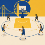
The Los Angeles Lakers, New York Knicks, and Golden State Warriors round out the top five. The Lakers’ current wordmark and basketball feel classic because the purple and gold palette is inseparable from franchise mythology, even though the identity began in Minneapolis. The Knicks remain high because their angular type and basketball construction have repeatedly translated Madison Square Garden energy into a resilient visual brand. Golden State’s bridge-centered identity was a major improvement over less focused prior systems. Tying the mark to the Bay Bridge gave the Warriors a civic symbol with elegant geometry and broad local resonance.
Just below that tier are Portland, San Antonio, Miami, Detroit, and Phoenix. Portland’s pinwheel is one of the smartest abstract logos in American sports, visually suggesting five players crossing with five opponents while also feeling in motion. San Antonio’s spur typography is simple and exact, proving that restraint can become identity. Miami’s flaming hoop remains one of the strongest 1980s creations because it combines attitude, climate, and basketball action without visual clutter. Detroit’s best branding periods emphasize industrial toughness, while Phoenix benefits from a sharp sunburst concept that matches the market better than many teams’ literal mascot choices.
The middle tier is crowded with solid but less timeless identities. Milwaukee’s deer head improved significantly when the club shifted toward a mature forest palette and cleaner antler geometry. Toronto finally escaped the novelty of the dinosaur-dribbling era by embracing clawed basketball forms and a more disciplined black-red system, though nostalgia still favors the original cartoon. Atlanta’s circular hawk works better than several previous experiments because it is compact and flexible. Utah’s mountain references and New Orleans’ pelican crest both gained strength by leaning into place rather than generic basketball symbols.
The lower middle includes Brooklyn, the Clippers, Orlando, Minnesota, and Cleveland. Brooklyn’s black-and-white shield was a smart market entry during the move from New Jersey, especially for merchandise and streetwear, but its Spartan style can feel emotionally cold. The Clippers improved after years of weak marks, yet they still lack a truly iconic symbol on the level of other major-market teams. Orlando’s star-ball history remains memorable, though newer marks have not always captured that original spark. Minnesota and Cleveland have each produced competent systems, but both franchises still live in the shadow of earlier visual highs.
The bottom ten are not disasters; they simply lag in distinctiveness. Philadelphia’s patriotic iconography is historically appropriate, yet the current 76ers system can feel more serviceable than inspiring. Denver’s mountain imagery is attractive, though several versions have split focus between altitude, pickaxes, and rainbows from different eras. Sacramento’s crown and wordmark are solid but not elite. Indiana’s P-basketball remains clean, but it rarely excites. Dallas has needed a full reset for years. Charlotte’s hornet has detail without enough iconic simplification. Memphis is competent but safe. Washington’s monument-centered branding underuses the capital’s visual possibilities. Oklahoma City is the clearest case of a franchise still waiting for a signature identity. Houston’s current look has never matched the visual force of earlier rocket-era branding.
The most important rebrands in league history
Several NBA rebrands changed more than aesthetics; they redirected how franchises were perceived. The Warriors’ 2010 switch back to royal blue and golden yellow, centered on the Bay Bridge, is a textbook example. It replaced a muddled recent history with an identity that felt civic, premium, and historically aware. That mattered because the team was positioning itself for a new arena future and broader regional identity. Once Stephen Curry turned the franchise into a dynasty, the logo became inseparable from a modern golden era. Good timing amplified good design.
Brooklyn’s 2012 launch shows another pattern: using a move to reset a franchise’s cultural standing. The Nets abandoned the visual leftovers of the New Jersey period and entered Brooklyn with a monochrome system associated with urban fashion, Jay-Z’s influence, and premium minimalism. In licensing terms, it worked immediately. The downside is that the mark still depends more on market cool than on basketball specificity. By contrast, New Orleans needed a complete renaming after the Hornets chapter. The Pelicans identity tied the franchise to Louisiana symbolism and restored local meaning, even if the branding has never fully unlocked the dramatic possibilities of that concept.
There are cautionary cases as well. The Thunder established a successful basketball operation without ever creating a logo equal to the team’s competitive profile. The shield, colors, and typography are generic by league standards, which is unusual for a franchise born from such a contentious relocation. Dallas presents a similar issue. The horse-head era has lasted a long time, but it belongs to an early-2000s design language of bevels and metallic motion lines. In my experience reviewing fan response and merchandising trends, these are the teams most often cited as needing a ground-up redesign rather than another incremental tweak.
How logos reflect relocation, nostalgia, and fan memory
NBA branding is inseparable from movement and memory. The Lakers kept a water-born nickname from Minnesota and transformed it into a Los Angeles luxury brand through color and star power. The Jazz retained a music-rooted name after moving from New Orleans to Utah, forcing design teams over decades to bridge an awkward semantic gap through mountains, notes, and color reinvention. The Kings carried monarchical language from Rochester to Cincinnati to Kansas City to Sacramento, demonstrating how some identities can survive geography because the core symbol is broad enough to travel.
Fans rarely judge logos in purely formal terms. They connect them to roster eras, playoff runs, childhood broadcasts, and specific courts. That is why the Toronto dinosaur, the Vancouver-era Grizzlies palette, and the Seattle SuperSonics space-age marks retain emotional power. Throwback demand is often a better measure of branding success than a design award. When a franchise reintroduces a classic uniform and sales spike, that tells you the old identity still carries narrative value. The best current design teams understand this and build systems that honor archival elements instead of erasing them.
What this ranking says about league history
Ranking every NBA team logo reveals a league shaped by continuity at the top and experimentation in the middle. The strongest brands usually know exactly who they are: Bulls, Celtics, Lakers, Knicks, Warriors, Spurs. Their logos anchor bigger stories about dynasties, arenas, cities, and television eras. Weaker identities are often attached to franchises still searching for a settled visual language, especially after relocation or uneven ownership periods. That is why logo history belongs at the center of NBA history, not at the margins.
For readers using this page as a League History hub, the takeaway is simple. Study logos and you will better understand expansion, relocation, merchandising, nostalgia, and the business of basketball. Great NBA logos endure because they express place and ambition with unusual economy. If you are exploring the history of any franchise, start with the logo timeline, then follow the uniforms, arenas, and rebrands that grew from it. Use this guide as your entry point, compare eras team by team, and revisit the marks that still define the league at a glance.
Frequently Asked Questions
What criteria are most useful when ranking NBA team logos?
The strongest way to rank NBA team logos is to look at them through both a design lens and a franchise-history lens. Visual clarity is usually the starting point: can the logo be recognized instantly from a broadcast bug, a social avatar, a center-court graphic, or a cap from across the room? Great sports marks work at multiple sizes, so a logo that looks sharp on a jersey patch but becomes cluttered on a mobile screen will usually rank lower than a cleaner, more adaptable design. Shape, balance, color contrast, typography, and memorability all matter because NBA branding has to function in fast, high-visibility environments.
Beyond pure aesthetics, symbolism plays a major role. The best NBA logos communicate something meaningful about the franchise, whether that is regional identity, a team nickname, a city landmark, a historic color scheme, or an era of sustained success. Longevity matters too, but not automatically. A logo does not rank highly just because it has been around for decades; it ranks highly when it survives because it still feels distinctive and relevant. Likewise, a newer logo can place well if it modernizes the brand without stripping away what fans associate with the team.
Flexibility is another major criterion. NBA logos now live far beyond the court. They need to succeed on merchandise, alternate uniforms, social graphics, video intros, digital collectibles, and international marketing. A top-ranked logo usually has a strong primary mark, a useful secondary mark, and a coherent color system that can support multiple uniform and branding applications. In other words, the most successful logos are not just attractive illustrations; they are complete identity systems. When you rank all 30 NBA teams, the logos that consistently rise to the top are the ones that combine recognizability, storytelling, adaptability, and staying power in a single mark.
Why have so many NBA teams rebranded their logos over time?
NBA teams rebrand for a mix of cultural, commercial, and competitive reasons. Sometimes the motivation is straightforward: a logo begins to feel dated, overly busy, or out of step with contemporary sports design. Teams then simplify lines, refresh typography, or shift color balance to make the mark more effective on modern platforms. This has become especially important in the digital era, where logos must read clearly on streaming overlays, apps, e-commerce stores, and social media icons. Designs that once worked well on print programs or embroidered warm-ups may not perform nearly as well in a screen-first environment.
Other rebrands are driven by franchise storytelling. A team may want to reconnect with a beloved era, revive classic colors, reference a city nickname, or distance itself from a less successful period in its history. Rebrands often happen when ownership changes, arenas open, uniforms are overhauled, or a franchise wants to signal a new direction. In those cases, the logo becomes a public declaration that the organization is entering a different chapter. That is why some redesigns emphasize tradition, while others intentionally break from it. Neither approach is automatically better; success depends on whether the new identity feels authentic to the team and legible to fans.
Merchandise also matters more than many fans realize. NBA branding is a global business, and teams want marks that sell well across jerseys, hats, collectibles, and lifestyle apparel. A logo that looks dynamic on-court but awkward on retail products may get reconsidered. At the same time, teams must be careful not to chase trends too aggressively. The most criticized rebrands are often the ones that feel generic, overproduced, or disconnected from local identity. The most respected ones preserve core meaning while improving execution. In that sense, NBA logo history is really the story of teams balancing memory, marketability, and modern design standards.
What makes an NBA logo timeless instead of trendy?
A timeless NBA logo usually has a strong central idea expressed with enough restraint that it can survive changing tastes. That often means a clean silhouette, disciplined use of color, and symbolism that does not require explanation every time someone sees it. Timeless logos are not necessarily simple in the minimalist sense, but they are usually coherent. Every element feels intentional. There is no sense that the design depends on a passing visual fad, such as excessive gradients, hyper-detailed shading, or typography that quickly signals a specific decade. When a logo remains effective across generations of uniforms and media formats, that is a strong sign of timelessness.
Another hallmark of timelessness is emotional continuity. Fans should be able to look at the logo and immediately connect it to the franchise’s identity, even as supporting design elements evolve. The best NBA marks tend to preserve a recognizable color palette, icon, or compositional logic over time. That continuity builds trust and familiarity. Even when a team updates its look, timeless branding usually keeps one foot in the past. It understands that sports logos are not just graphic assets; they are inherited symbols tied to memory, loyalty, championships, and civic pride.
By contrast, trendy logos often overreact to the design climate of the moment. They may look exciting at launch but age quickly because they prioritize style over substance. In ranking NBA logos, this distinction matters a lot. A mark that felt fresh for five years but now looks locked into a narrow era will generally rank below one that has remained recognizable and convincing for decades. Timeless logos earn that status by doing the hard thing: they stay relevant without constantly demanding reinvention.
How important is local culture and city identity in an NBA team logo?
Local culture is one of the most powerful ingredients in a successful NBA logo because it gives the design meaning beyond the team name itself. When a logo reflects a city’s geography, history, architecture, industries, music, state symbolism, or civic mythology, it becomes more than a sports brand. It becomes a visual shorthand for place. That connection can make even a relatively simple mark feel richer and more resonant. Fans are not just supporting a roster; they are representing where they are from, what their city values, and how the franchise fits into the broader story of the community.
This is also why some logos outperform others in rankings even when the artwork is not especially complicated. A mark that captures a city’s identity in a clean, memorable way often feels more authentic than one that is polished but generic. Teams that incorporate meaningful regional references tend to build stronger emotional loyalty because fans can see themselves in the branding. Those references do not have to be literal. Sometimes color choices, letterforms, or secondary symbols are enough to create a strong local connection. The key is that the branding should feel earned, not artificially attached.
That said, local identity works best when it is translated into design with clarity and discipline. A logo can have a great concept and still rank lower if it is crowded, outdated, or difficult to reproduce. The best NBA logos fuse local storytelling with practical execution. They communicate “this is our city” while still functioning beautifully on uniforms, courts, and digital media. In a league where every team competes for attention nationally and globally, local identity is often what keeps a logo from feeling interchangeable.
Can a great NBA logo still struggle if it does not work across uniforms, broadcasts, and merchandise?
Absolutely. In modern sports branding, a logo is only as strong as its performance across real-world applications. A design can be conceptually brilliant and visually impressive in isolation, yet still underperform if it becomes muddy on a small screen, too intricate for embroidery, awkward on alternate jerseys, or inconsistent across print and digital formats. NBA teams need logos that can move seamlessly between center-court presentation and micro-scale use, from giant arena signage to a tiny social media avatar. If that adaptability is missing, even a beautiful logo can fall in rankings because it is not fully doing the job a contemporary franchise mark is expected to do.
Uniform integration is especially important. Some logos are excellent as standalone emblems but do not translate naturally into wordmarks, monograms, side patches, or alternate color treatments. Others may look strong in one colorway and weak in another, which becomes a real issue in a league built around statement uniforms, city editions, retro nights, and merchandise drops. Broadcast visibility matters too. NBA logos appear constantly in score bugs, replay packages, bracket graphics, and highlight thumbnails. A logo that reads instantly in motion has a major advantage over one that requires pause-and-study appreciation.
Merchandise is the final test. Fans wear NBA branding in everyday life, not just on game day, so the logo has to look good on hats, hoodies, jackets, and lifestyle apparel. Some team marks become cultural symbols because they are both team-specific and fashion-friendly. That does not mean every logo should be stripped down into generic minimalism, but it does mean usability affects perception. When ranking NBA team logos, practical versatility is not a secondary concern; it is part of the core evaluation. The best logos do not force a choice between storytelling and function. They deliver both, consistently, wherever the brand appears.