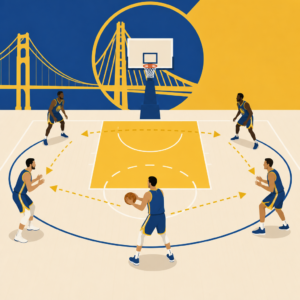


Shot quality in basketball analytics measures how good a scoring opportunity is before the ball goes in or misses, and it is one of the clearest ways to explain why some offenses stay efficient over time while others live on hot shooting streaks. In simple terms, shot quality asks a direct question: based on location, defender distance, shot type, play context, and shooter skill, how many points should this attempt be worth on average? I use this concept constantly when reviewing NBA games because raw field goal percentage can hide what actually happened. A team can shoot 50 percent on difficult pull-ups and still have played a shaky offensive game, while another team can miss clean corner threes and layups yet create the better process. That difference between result and process is why shot quality matters.
In modern NBA analysis, shot quality sits at the intersection of tracking data, expected value, and tactical evaluation. Analysts use optical tracking, play-by-play logs, and location-based shot charts to estimate expected points per attempt. Coaches use those estimates to judge whether their offense generated sustainable looks. Bettors and front offices use them to spot regression candidates. Fans use them to understand why an efficient team offense usually produces rim attempts, corner threes, free throws, and open catch-and-shoot looks rather than a steady diet of contested midrange jumpers. The term is closely related to expected effective field goal percentage, expected points per shot, and expected true shooting. The exact formula varies by provider, but the underlying idea is consistent: evaluate the quality of the attempt independent of whether the shot happened to fall.
This matters because basketball is noisy in small samples. A shooter can make three heavily contested jumpers in two minutes; that does not make those shots efficient choices across a season. Likewise, a team can miss ten open threes in a playoff game; that does not automatically mean the offense failed. Shot quality provides context. It also helps connect film study to numbers. If you watch an offense bend the defense with paint touches, force a low man rotation, and kick to the weak-side corner, the model should usually label that possession as productive even if the shot rims out. For anyone building NBA analysis skills, understanding shot quality is essential because it explains efficiency more accurately than box score percentages alone.
How shot quality is calculated in basketball analytics
Shot quality models estimate expected scoring value by combining variables that strongly influence make probability. The most important inputs are shot location, shot type, defender proximity, time on the shot clock, whether the shot was assisted, movement into the shot, and the identity of the shooter. At the team level, some models focus on the chance an average NBA player would convert the attempt. Others personalize the estimate by incorporating a player’s historical shooting talent from that zone and action type. Both approaches are useful, but they answer slightly different questions. A context-only model judges the possession design and defensive pressure. A shooter-adjusted model judges the likely outcome for that specific player taking that specific shot.
Location is foundational because the league has clear efficiency zones. Restricted area attempts are worth more on average than non-rim twos because they convert at a much higher rate and often draw fouls. Corner threes are generally more efficient than above-the-break threes because the line is shorter and many come from drive-and-kick actions with cleaner feet set. Midrange shots, especially long contested pull-ups, usually carry lower expected value unless taken by elite specialists such as Kevin Durant or Devin Booker. Tracking systems introduced across the NBA made these distinctions sharper by adding defender distance and movement data. A wide-open catch-and-shoot three from the corner and a tightly contested sidestep three from 28 feet both count as three-point attempts in a box score, but their shot quality is nowhere near the same.
Context matters too. A shot created after multiple paint touches, a pick-and-roll collapse, or a transition advantage is usually stronger than one taken late in the clock after the offense stalls. Some models assign value to “rim-and-three” creation patterns because they consistently produce efficient offense. Others account for whether the shot came off an offensive rebound, a cut, a post-up kick-out, or a handoff. When I audit team offense, I rarely stop at field goal percentage. I look at expected points generated by shot profile and compare that with actual points. Over time, large gaps tend to shrink. Teams that keep generating high-quality shots usually climb back toward strong efficiency even after short slumps.
Why shot quality explains offensive efficiency better than raw percentages
Raw percentages describe outcomes. Shot quality describes opportunity. That distinction is crucial if the goal is to predict future efficiency rather than simply recite what already happened. If Team A shoots 42 percent from three for two weeks, the first question should be whether those attempts were open, in rhythm, and taken by good shooters. If Team B shoots 31 percent over the same period but creates cleaner looks, Team B may actually have the more sustainable offense. This is why expected effective field goal percentage often tracks future offensive rating better than short-run shooting percentages. The model strips away some randomness and centers the quality of the possession.
The best offenses do not merely rely on hot hands; they generate repeatable advantages. Think of a high-level spread pick-and-roll attack. The ball handler turns the corner, the big defender commits, the weak-side tag rotates, and the offense creates either a layup, dunk, lob, corner three, or open slot three. Those are premium outcomes because each one carries strong expected value. By contrast, an offense that settles for late-clock isolations and contested long twos can survive for stretches with elite shotmaking, but the margin for error is thinner. Shot quality captures this difference cleanly. It rewards process over short-term variance.
There is also a defensive mirror to the metric. If a defense allows a low expected points per shot, it is generally doing the right things: containing the ball, shrinking driving lanes, staying attached to shooters, and forcing non-ideal attempts. Of course, a defense can execute well and still get burned by difficult makes. That is why good analysts separate shotmaking against coverage from coverage quality itself. During playoff series, this distinction becomes especially important because narratives often overreact to makes and misses without accounting for whether the defense forced the intended result.
What goes into a good or bad shot profile
A good shot profile is built around efficient zones and actions. In the NBA, that usually means restricted area attempts, free throws, corner threes, and open above-the-break threes created by drive-and-kick, transition flow, cuts, slips, and ball screens. A bad shot profile usually leans too heavily on contested midrange jumpers, off-balance floaters against size, late-clock bailouts, and non-paint twos without foul pressure. That does not mean every midrange shot is bad. It means the offense must earn enough value elsewhere or have elite specialists who can outperform the baseline expectation.
Player archetypes shape shot quality in important ways. Stephen Curry can turn a semi-open 30-footer into a strong expected possession because his shooting range warps standard assumptions. Nikola Jokić improves shot quality for teammates by forcing help and delivering passes that create layups and open threes. Giannis Antetokounmpo raises expected value simply by collapsing the defense and generating rim pressure. On the other side, poor spacing can lower shot quality even before a shot is taken. If two weak shooters stand near the dunker spot and strong-side corner, help defenders can crowd the paint, reducing the quality of drives, cuts, and kick-outs across the possession.
| Shot type | Typical quality | Why it rates that way |
|---|---|---|
| Restricted area layup or dunk | Very high | Highest conversion rates and strong foul-drawing potential |
| Corner catch-and-shoot three | High | Shorter distance and often created by rotation-forcing drives |
| Above-the-break catch-and-shoot three | High to medium | Efficient when open, less so when rushed or tightly contested |
| Floater in traffic | Medium to low | Useful counter shot, but usually less efficient than rim attempts |
| Contested long midrange pull-up | Low | Lower make rate and no three-point bonus unless taken by elite specialists |
This profile lens also explains team-building choices. Front offices invest in spacing wings, vertical lob threats, and pull-up creators because those players improve the geometry of possessions. Coaches emphasize pace, paint touches, and quick decisions because delayed attacks allow defenses to reset. When a team says it wants to “win the math battle,” it usually means increasing the volume of efficient shots while suppressing the least efficient ones. Shot quality gives that idea a measurable backbone.
How teams, coaches, and analysts actually use shot quality
In practice, shot quality is not just a public stat on social media graphics; it is a workflow tool. Coaching staffs use it in game prep to identify where an opponent’s offense is living. If a team’s recent scoring surge comes from difficult pull-up shooting, the scouting report may note likely regression and prioritize taking away rim pressure first. If the surge comes from relentless creation of corner threes and restricted area finishes, the concern is more structural. Analysts in front offices compare actual efficiency with expected efficiency to flag buy-low or sell-high signals. A bench unit that generates good looks but shoots poorly may need patience rather than a lineup overhaul.
I have found shot quality especially valuable when paired with film clips. Numbers alone can tell you that a team generated a strong expected points per half-court possession. Film tells you how. Maybe the edge came from ghost screens pulling the big away from the rim, or from empty-side pick-and-rolls that removed weak-side help, or from post isolations that forced scram switches and opened skip passes. The metric is strongest when it guides questions rather than replacing them. Why did the offense create these shots? Are they repeatable against better defenses? Which player drives the quality most often? Those are the real analytical questions.
Public platforms such as NBA tracking data, Cleaning the Glass style shot-profile splits, Synergy play-type classifications, and Second Spectrum-derived context all inform this work. The exact labels differ by provider, but the best use case is the same: identify sustainable process. Teams that repeatedly create high-value chances usually finish near the top of offensive ratings across long samples. Teams that rely on contested shotmaking often fluctuate more dramatically from month to month.
Limits, misconceptions, and the right way to interpret the stat
Shot quality is powerful, but it is not perfect. First, models are only as good as their inputs. Defender distance does not fully capture the pressure of a long wing recovering from behind, the influence of rim deterrence, or whether a shooter was off balance before the catch. Second, player skill can bend the model. Elite pull-up shooters and elite finishers consistently outperform average expectations, which means a generic model may underrate their true efficiency. Third, late-clock heaves and end-game situations create context that broad averages can flatten. Not every low-quality shot is a bad decision; sometimes it is the least bad option left.
A common misconception is that shot quality says makes do not matter. They do. Results decide games. The purpose of the metric is to explain whether the process behind those results is likely to hold. Another misconception is that the stat only praises threes and dunks. In reality, it values any shot that produces strong expected points. If a player can hit a midrange jumper at elite volume and accuracy, that shot can become efficient within his personal profile. The key is not ideological purity; it is expected value relative to alternatives.
The best interpretation is layered. Start with the team view: what kinds of shots are being created and allowed? Move to the player view: who is generating those chances, and who is outperforming or underperforming expectation? Then return to the film: are those patterns likely to survive playoff scouting, fatigue, and opponent adjustments? Used this way, shot quality becomes one of the most practical basketball analytics tools available. If you want sharper NBA analysis, start by separating shotmaking luck from shot creation quality, then build your evaluation from there.
That approach turns the stat into a hub for broader analytics thinking. It connects spacing, play design, matchup hunting, passing reads, rim pressure, and defensive coverage into one useful framework. It also keeps analysis honest. Instead of praising every made jumper or criticizing every missed three, you evaluate whether the possession produced the kind of opportunity winning teams seek over hundreds of games. In the long run, that is what efficiency really means.
For readers using this page as a starting point for NBA analysis, shot quality is the concept that links almost every other analytics topic. Offensive rating makes more sense when you know what types of shots feed it. True shooting percentage becomes more meaningful when you understand why free throws and threes shift efficiency. Lineup data is easier to interpret when you recognize which five-man groups create spacing, rim pressure, and passing windows that lift expected points per shot. Even player development ties back to this idea. A guard improving his handle can create cleaner separation, a wing refining relocation habits can turn average spot-ups into open ones, and a center becoming a short-roll passer can upgrade the quality of teammates’ attempts without taking more shots himself.
The practical takeaway is simple: judge the process before you judge the percentage. When you watch an NBA game, ask where the shots came from, how the defense was moved, who forced the rotation, and whether the offense produced looks that would score well across a large sample. That habit will make box score swings less misleading and film study more precise. If you are building your own NBA analytics toolkit, make shot quality one of the first stats you learn, then use it as the bridge to deeper topics across the Analytics section.
Frequently Asked Questions
What does shot quality mean in basketball analytics?
Shot quality is a basketball analytics concept that estimates how valuable a shot attempt was before the result is known. Instead of focusing only on whether the ball went in, shot quality looks at the process behind the attempt. The idea is simple: every shot has an expected value based on factors such as where it was taken from, how closely the shooter was defended, whether it came off the dribble or the catch, the type of play that created it, the game situation, and in many models, the skill level of the shooter taking it. When analysts talk about a shot being “good” or “bad,” they usually mean the expected points tied to that attempt, not the final outcome of one possession.
For example, an open corner three usually rates as a higher-quality shot than a contested mid-range jumper because league-wide data shows the open three produces more points on average over time. That does not mean the corner three will always go in or the mid-range shot can never be smart. It means that, across a large sample, one shot profile is typically more efficient than the other. This is why shot quality is so useful for evaluating offenses. It separates repeatable offensive creation from short-term shooting luck and helps explain why some teams sustain efficiency over a season while others depend too heavily on difficult makes.
How is shot quality calculated?
Shot quality is usually calculated through expected points models built from massive collections of play-by-play and tracking data. These models assign an average scoring value to a shot attempt based on variables that consistently influence efficiency. Common inputs include shot location, defender proximity, shot type, angle, time on the shot clock, whether the attempt came in transition or the half court, whether it was self-created or assisted, and what kind of action generated it, such as a pick-and-roll, cut, spot-up, post-up, or drive-and-kick sequence. More advanced models also layer in shooter talent, team context, rim protection, and even the quality of the pass leading into the shot.
The final output is often expressed as expected points per shot. If a certain type of attempt is worth 1.18 points on average, that shot would be considered stronger than one worth 0.84 points on average. Some public-facing analytics platforms simplify this into a team-level or player-level “shot quality” score, while more technical systems may report expected effective field goal percentage, expected points per possession, or a shot quality differential that compares expected performance to actual results. The exact formula varies by provider, but the core principle remains the same: estimate how many points the opportunity should produce over time, independent of whether that one shot happened to fall.
Why is shot quality important for explaining offensive efficiency?
Shot quality is important because it gives analysts a clearer view of process, which is often more stable than raw results. Offenses can look elite for a stretch because they are making an unsustainably high percentage of difficult shots, or they can look worse than they really are because quality looks simply are not falling for a week or two. By measuring the expected value of the shots a team generates, shot quality helps identify whether an offense is consistently creating favorable opportunities or just riding variance. This is one of the clearest ways to explain efficiency over time.
Teams with strong shot quality usually create shots at the rim, open threes, free throws, or other efficient attempts that hold up over larger samples. That matters because sustainable offenses tend to pressure defenses with spacing, paint touches, passing, screening, and decision-making that lead to repeatable advantages. On the other hand, an offense built around contested pull-up jumpers may post strong scoring numbers in a hot stretch, but its underlying shot quality may warn that regression is likely. Coaches, analysts, and front offices use this information to judge whether the offense is functioning well even when the scoreboard fluctuates. In that sense, shot quality is not just a descriptive stat. It is a diagnostic tool for understanding whether the way a team scores is built to last.
Does shot quality account for shooter skill, or is it only about the shot itself?
That depends on the model, and this is an important distinction. Some shot quality models focus primarily on the characteristics of the shot itself. Those models ask, in effect, “How valuable is this attempt for an average NBA shooter?” This approach is useful for isolating offensive creation and understanding how clean the look was regardless of who took it. It can show whether a team generated an open three or a tightly contested long two without letting elite shot-making talent hide weak process.
Other models incorporate shooter skill because not every player converts the same opportunities at the same rate. An open three for a 42 percent shooter is not the same practical scoring chance as an open three for a player defenses are willing to ignore. Including shooter talent can make expected value estimates more realistic when evaluating actual team offense or player decision-making. In practice, both approaches have value. Shot-based models are excellent for judging chance creation. Skill-adjusted models are better for projecting what a team or player should score in the real world. The key is to know which version you are looking at, because the interpretation changes. If a model says a shot was high quality, that could mean it was a strong shot in theory, a strong shot for that specific player, or both.
What are the limits of shot quality, and why should it not be used alone?
Shot quality is powerful, but it is not a complete explanation of offense by itself. First, any model is only as good as the data and assumptions behind it. If the tracking data misses a nuance, such as a late contest, unusual defensive pressure, or a shooter’s balance after a difficult pass, the estimate may not fully capture the true difficulty of the attempt. Second, basketball is not only about the final shot. Turnovers, offensive rebounds, free-throw generation, foul pressure, pace control, lineup fit, and transition defense all shape team efficiency. A team can generate strong shot quality but still underperform because it gives away possessions or fails to get back on defense.
There is also the issue of special shot-makers. Some players consistently outperform standard shot quality expectations because they are unusually skilled at making difficult attempts. Think of elite pull-up shooters, stars with exceptional touch in the mid-range, or finishers who can score through contact and length. A model may label those attempts as low quality in a general sense, yet those players can still make them valuable within their own offensive profile. That is why the best analysis uses shot quality alongside film study, lineup context, usage patterns, and actual results. Shot quality tells you a lot about the quality of the opportunity. It does not, by itself, tell you everything about the player, the possession chain, or the broader strategic tradeoffs shaping efficiency.