
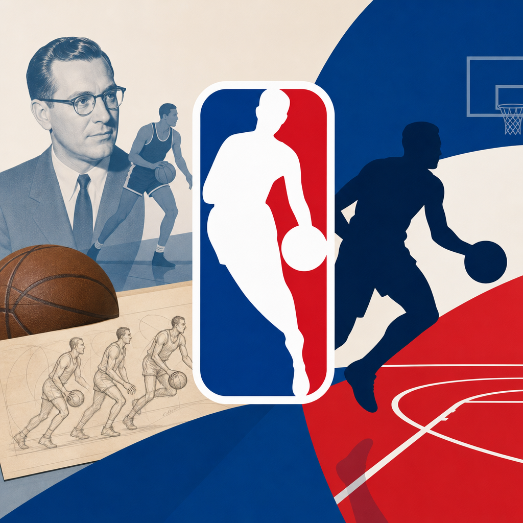
The NBA logo is one of the most recognizable marks in global sports, yet its history is richer than the familiar red, white, and blue silhouette suggests. When readers ask who inspired the NBA logo and how it became an icon, they are really asking several connected questions: who designed it, which player served as the model, why the league adopted it in the first place, and how the logo came to represent far more than a simple brand asset. As the central hub for NBA league history, this guide explains the origin of the emblem, the business context behind its creation, the debate around Jerry West’s role, and the reasons the logo still matters in modern basketball culture.
In practical terms, the NBA logo is the league’s official visual identifier: a vertical rectangle split into blue and red fields with a white dribbling player in the center. It debuted in 1969, a period when professional basketball was fighting for cultural space in a crowded American sports market. Baseball already had a classic emblem through Major League Baseball, football was strengthening its national footprint, and basketball executives understood that a young league needed a polished identity. The symbol had to communicate movement, professionalism, and legitimacy in one glance. That requirement shaped every design choice and helped turn the logo into a lasting piece of sports history.
The key name associated with the image is Jerry West, the Hall of Fame guard whose smooth dribble and upright posture matched the silhouette perfectly. Another key name is Alan Siegel, the designer who created the mark while working in sports branding. Their roles are different but equally important: West inspired the figure, while Siegel transformed a photograph into a simple, reproducible corporate emblem. Understanding that distinction matters because many casual fans blur the line between inspiration and authorship. The logo was not drawn by West, and the league has never formally marketed it as his portrait. Still, the connection is strong enough that he has been widely known for decades as “the Logo.”
This topic matters beyond trivia because the NBA logo sits at the intersection of league expansion, media strategy, merchandising, labor politics, and player mythology. I have worked on sports history content and brand analysis projects where one lesson repeats constantly: a logo survives for generations only when it captures a story bigger than design. The NBA mark does exactly that. It reflects the late 1960s push to modernize the league, the rise of television-friendly branding, and the tension between celebrating individual stars and promoting a collective institution. For anyone exploring NBA league history, the logo is not a side note. It is a compact history of how the NBA learned to present itself to the world.
How the NBA Logo Was Created in 1969
The NBA adopted its current logo in 1969, during a time of major transition for professional basketball. The league had been founded in 1946 as the Basketball Association of America, merged with the National Basketball League in 1949, and spent the following decades building credibility city by city. By the late 1960s, the NBA needed a stronger public image. Franchises were stabilizing, television mattered more, and league offices understood that visual consistency could support ticket sales, sponsorships, and national awareness. The logo project was therefore not cosmetic; it was a strategic decision tied to league growth.
Alan Siegel, who later became well known for identity design in sports and media, developed the mark. His inspiration came partly from the success of the Major League Baseball logo, also associated with his firm’s work. The design brief was simple but demanding: create something bold, instantly legible, and timeless enough to appear on print materials, arenas, merchandise, and broadcast graphics. Siegel used a photograph of Jerry West from his playing days with the Los Angeles Lakers and simplified it into a clean silhouette. The dribble stance conveyed motion without clutter, and the vertical frame created a strong badge shape that reproduced well at different sizes.
The year 1969 is important because it places the logo in a wider sports branding wave. American leagues were beginning to think nationally rather than purely locally. A memorable mark could help unify teams under one umbrella and give media outlets a standard symbol to display. The NBA’s color choices also carried meaning. Red, white, and blue aligned with other major U.S. sports properties and projected stability and patriotism during a turbulent era. The result was not flashy. It was disciplined, practical, and easy to remember, which is exactly why it lasted.
Who Inspired the NBA Logo: The Jerry West Connection
Jerry West is the player most commonly identified as the inspiration for the NBA logo, and the evidence supporting that belief is substantial. West was one of the league’s premier guards in the 1960s, known for precise footwork, controlled dribbling, and an upright style that translated clearly into silhouette form. He played for the Los Angeles Lakers from 1960 to 1974, made 14 All-Star teams, won the 1972 NBA championship, and remains the only player to win Finals MVP from the losing team, earning that award in 1969. His excellence and visual distinctiveness made him a compelling model for a league seeking elegance rather than brute force in its primary emblem.
Siegel has acknowledged that a photo of West served as the source material. The image, taken by Wen Roberts, showed West dribbling in a composed, balanced posture. From a designer’s standpoint, it was ideal. A silhouette must remain recognizable after detail is stripped away, and many action photos do not survive that transition. A dunk can become chaotic; a post-up can look static. West’s dribble gave the logo rhythm, verticality, and unmistakable basketball identity. In that sense, he did not just happen to be in the source photograph. His playing style solved the design problem.
The NBA has historically avoided officially confirming West as the logo’s subject. That reluctance is partly legal and partly philosophical. If the league definitively tied the mark to one player, it could raise questions about compensation, rights, and precedent. It could also shift attention away from the league as a whole. West himself has often expressed discomfort with being the face of the logo, not because he rejects the honor, but because he has preferred to keep the focus on the sport. Even so, among historians, brand experts, and longtime fans, the Jerry West connection is accepted as the best-supported account.
Why the Logo Became an Icon
The NBA logo became iconic because it succeeded on three levels at once: visual clarity, emotional association, and institutional consistency. First, the design is simple enough to process instantly. A human figure, a ball, and two color blocks are easy for the eye to read on a jersey patch, a television chyron, or a social media avatar. Second, the silhouette evokes aspiration. It does not show a specific team, race, city, or era in obvious terms, so fans from different generations can project their own meaning onto it. Third, the league has used it relentlessly and consistently for more than five decades, which is how symbols become part of culture.
From a brand management perspective, longevity matters as much as artistry. I have seen newer sports identities generate excitement at launch and then fade because leagues changed direction too often. The NBA avoided that mistake. While the logo has received minor refinements for cleaner reproduction across media, the core form has remained stable. That stability helped the symbol gather history. It appeared during the ABA-NBA rivalry, the 1976 merger, the rise of Magic Johnson and Larry Bird, Michael Jordan’s global expansion era, the Kobe Bryant and Shaquille O’Neal Lakers years, LeBron James’s player-empowerment age, and today’s international growth around stars like Nikola Jokić and Luka Dončić. Every era added meaning without requiring a redesign.
| Factor | Why It Worked | NBA Example |
|---|---|---|
| Simple silhouette | Easy to recognize at any size | Visible on apparel, courts, apps, and broadcasts |
| Player motion | Conveys basketball instantly | Dribble stance suggests skill and control |
| Neutral identity | Represents the whole league, not one team | Used across all franchises and events |
| Consistent use | Builds familiarity over decades | Featured from print media to digital platforms |
| Historic continuity | Accumulates meaning through eras | Connected to stars from West to Wembanyama |
Merchandising amplified the effect. As the NBA’s licensing business expanded, the logo moved beyond official documents and into everyday life through hats, warmups, basketballs, video games, trading cards, and global retail. Once a symbol appears both on championship broadcasts and in streetwear, it stops being merely administrative and becomes cultural. That is exactly what happened here. The logo came to signal not just the league office but the broader idea of elite basketball.
Debates, Redesign Talk, and the Modern Meaning of the Logo
No long-standing emblem remains free from debate, and the NBA logo is no exception. In recent years, public discussion has intensified whenever a legendary player dies, a new generation takes over, or social issues push leagues to reassess representation. After Kobe Bryant’s death in 2020, many fans argued that the NBA should change the silhouette in his honor. Similar conversations have occasionally surfaced around Michael Jordan, LeBron James, and other transformative stars. These proposals usually come from genuine admiration, but they run into the same challenge: replacing a timeless league mark with a tribute to one player can create as many problems as it solves.
There are strong arguments for keeping the current design. It already functions as an abstracted symbol rather than a marketed portrait, and its strength comes from continuity. A redesign would require the NBA to update thousands of assets across merchandise, signage, licensing agreements, digital products, style guides, and archival materials. More important, changing the logo could turn a stable institutional symbol into a rotating honorific. That would weaken its central purpose. Leagues need marks that outlast individual careers, even historic ones.
At the same time, the debate reveals something meaningful about NBA history. Basketball culture is deeply star-driven. Fans often connect to the league through players first and institutions second. The logo controversy therefore mirrors a larger truth about league history: the NBA grew because it balanced superstar appeal with centralized branding. West, Bird, Magic, Jordan, Allen Iverson, Stephen Curry, and many others pulled audiences in, while the logo and league identity converted that attention into a durable business. The emblem’s modern meaning is not just about design. It is about how the NBA turned individual brilliance into a coherent global brand.
For readers using this page as a hub for league history, that lesson links to many related topics worth exploring further: the BAA-NBL merger that formed the NBA, the ABA merger that changed style and talent depth, the television boom of the 1980s, the Dream Team’s effect on international basketball, the salary cap and collective bargaining system, expansion franchises, and the digital media era. The logo touches all of them because it served as the league’s visual constant while the business and the game evolved around it.
What the NBA Logo Tells Us About League History
The clearest takeaway from NBA logo history is that the mark became iconic because it arrived at the right moment, used the right model, and served the right institutional need. Alan Siegel translated a photograph of Jerry West into a clean, adaptable symbol in 1969, when the NBA urgently needed a stronger national identity. West’s image provided grace, control, and unmistakable basketball movement. The league’s disciplined use of that symbol across decades then transformed a smart design into a historic emblem. Few sports logos achieve that combination of practicality and myth.
For anyone studying NBA league history, the logo offers a compact way to understand how the league matured. It reflects branding strategy, media expansion, star power, legal caution, and the long-term value of consistency. It also shows why some symbols endure while others fade: the best logos do not chase trends. They express a stable idea that can absorb change around them. The NBA’s mark has done that through every major era of modern basketball, from black-and-white television to streaming platforms watched worldwide.
If you are building out your understanding of NBA history, start with the logo, then follow the story outward into mergers, commissioners, labor agreements, expansion, global marketing, and the players who defined each generation. The emblem makes more sense when placed inside that larger history, and the larger history becomes easier to grasp once you understand why this single silhouette still carries so much meaning. Explore the rest of the NBA History hub with that lens, and the league’s evolution will come into sharper focus.
Frequently Asked Questions
Who inspired the NBA logo, and is it really based on Jerry West?
Yes, the player most widely recognized as the inspiration for the NBA logo is Jerry West. Although the league has often avoided officially marketing the logo as a portrait of one specific person, the now-famous dribbling silhouette was derived from a photograph of West during his playing career. The image captured his upright posture, controlled dribble, and balanced movement, all of which translated perfectly into a clean, timeless graphic. That combination of athletic grace and visual simplicity is a major reason the design has endured for decades.
What makes this especially interesting is that the logo was never intended to function like a literal player portrait. Instead, Jerry West’s outline served as an ideal model for representing the sport itself. His silhouette communicated speed, poise, skill, and professionalism without requiring facial detail or team-specific elements. Over time, that ambiguity actually helped the logo become more powerful. Fans may recognize the connection to West, but the mark also feels bigger than any one player, which has allowed it to symbolize the entire league across generations.
Who designed the NBA logo, and what was the original idea behind it?
The NBA logo was designed by Alan Siegel, a branding expert who created it in 1969. At the time, the league wanted a stronger visual identity—something that could help establish the NBA as a modern, nationally recognizable sports organization. Basketball was growing in popularity, and the league needed a symbol that looked official, memorable, and adaptable across media, merchandise, and promotional materials. Siegel responded with a bold, vertical logo featuring a white player silhouette set between red and blue panels.
The design was influenced by the success of Major League Baseball’s logo, which used a similar red, white, and blue format. But the NBA version had to capture a very different kind of movement. Baseball can be represented in a static stance or a swing, while basketball is fluid and continuous. That is why the dribbling figure worked so well. It suggested action, rhythm, and athletic elegance in a single image. The original concept was not just to create a badge for paperwork or uniforms, but to build an identity that would help define the league in a crowded sports marketplace. In that sense, the logo was both a design solution and a strategic branding move.
Why did the NBA adopt the logo when it did, and what was happening in league history at the time?
The NBA adopted the logo in the late 1960s during a period when the league was trying to sharpen its public image and expand its national presence. Professional basketball was still developing its place in the American sports landscape, and the NBA faced competition not only for fans’ attention but also for legitimacy, media visibility, and commercial growth. A strong visual identity was part of the league’s effort to present itself as polished, major-league, and forward-looking.
This was also a time when sports leagues increasingly understood the value of branding. Television exposure was becoming more important, merchandise opportunities were expanding, and leagues needed symbols that could instantly communicate authority and recognition. The NBA logo helped solve that problem. It gave the league a consistent visual shorthand that could appear on broadcasts, printed materials, courtside signage, licensed products, and later digital platforms. In historical terms, the logo arrived at exactly the right moment: early enough to help shape the NBA’s modern identity, but with a design strong enough to remain relevant as the league evolved into a global entertainment and cultural force.
How did the NBA logo become such an enduring icon in sports and popular culture?
The NBA logo became iconic because it succeeded on multiple levels at once. From a design perspective, it is simple, balanced, and instantly recognizable. The vertical composition stands out clearly, the color palette ties it to a classic American sports identity, and the silhouette is dynamic without being overly detailed. These qualities make it highly versatile, which is a major reason it has remained effective across decades of changing media—from print and television to apparel, social media, and global marketing campaigns.
Just as important, the logo rose alongside the growth of the league itself. As the NBA expanded its audience through stars, rivalries, playoffs, and international exposure, the logo became attached to some of the most memorable moments in basketball history. It appeared during the eras of Magic Johnson and Larry Bird, Michael Jordan’s rise, the globalization of the sport, and the modern age of superstar branding. Because of that long association, the mark came to represent more than the league office or official branding. It came to symbolize excellence, competition, cultural relevance, and basketball at its highest level. Few sports logos achieve that kind of emotional and historical weight, which is why the NBA logo remains one of the most respected visual identities in the world.
Has the NBA logo changed over the years, and why has the league kept it so consistent?
The NBA logo has remained remarkably consistent since its introduction, and that stability is one of the reasons it has become so powerful. While the league has made minor refinements in presentation, formatting, and usage across different materials, the core design—the red and blue background with the white dribbling silhouette—has stayed intact. In branding terms, that kind of continuity builds trust, recognition, and prestige. Fans do not need to relearn the symbol, and each passing era adds more history to the same visual mark.
The league has kept it consistent because changing a logo that already carries enormous equity is risky and often unnecessary. The NBA’s mark still feels modern because its strength comes from clean form rather than trend-driven detail. It does not depend on flashy typography, gradients, or era-specific styling that might quickly look dated. There have been periodic public discussions about whether the league should update the logo to reflect a newer player or a new generation, but the existing design continues to work precisely because it is broader than any single moment. It honors the league’s history while remaining flexible enough to represent today’s game, which is a rare achievement in sports branding.