
The oldest NBA logos still in use are more than nostalgic graphics. They are compressed pieces of league history that show how franchises built identity, survived relocation threats, adapted to television, and stayed recognizable through decades of design change. In NBA history, a team logo is not just decoration on a jersey or center-court mark. It is a commercial asset, a civic symbol, and a shorthand for an era. When a mark survives multiple ownership groups, uniform redesigns, and marketing trends, it tells us something durable about the franchise behind it.
By oldest NBA logos still in use, I mean active visual identities whose core concept remains continuous from an earlier era, even if linework, color balance, and typography have been modernized. A logo can be refreshed without losing its historical DNA. The Chicago Bulls, for example, have cleaned up applications over time, but the angry red bull head introduced in the 1960s is fundamentally the same symbol today. That distinction matters because NBA branding history is full of revisions that look small on the surface yet represent complete strategic resets. This article serves as a hub for league history by tracing which designs endured, why they lasted, and what they reveal about broader NBA development.
I have worked through old media guides, style sheets, jersey archives, and court photos enough to know that logos are one of the fastest ways to read franchise history accurately. They show expansion waves, the ABA merger period, the rise of national television, and the merchandising boom after the 1980s. They also connect directly to adjacent topics across NBA history, including team relocations, uniform evolution, branding economics, and the league’s transition from regional sports property to global entertainment business. Understanding which logos survived is useful because it highlights the franchises that resisted short-term trends and turned consistency into competitive advantage off the court.
Why logo longevity matters in NBA league history
Long-lasting logos matter because consistency compounds value. In practical terms, a stable identity improves merchandise recognition, simplifies licensing, and builds instant recall across generations of fans. The NBA’s biggest branding successes usually come from marks that can work in several contexts: television bugs, hardwood decals, digital avatars, throwback apparel, and international retail. A logo that remains legible and emotionally resonant through all of those uses has unusual durability.
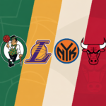
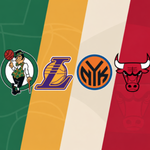
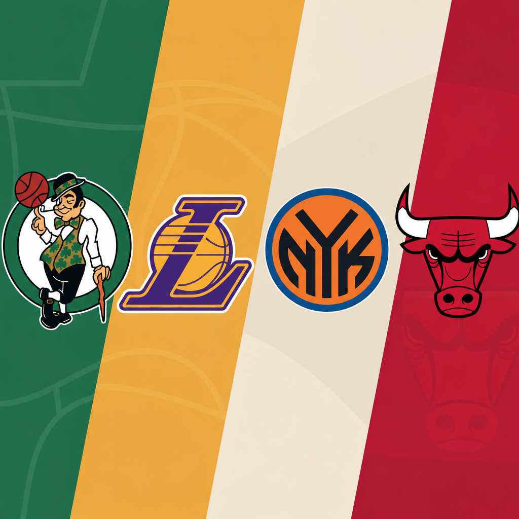
Logo longevity also reflects organizational confidence. Franchises that constantly overhaul visual identity often do so because performance, ownership, or market positioning is unstable. Teams with enduring logos usually found an image tied to place or personality that did not need reinvention every decade. The Bulls’ bull, the Celtics’ Lucky the Leprechaun, and the Lakers’ wordmark all communicate a clear story immediately. Even people who do not follow the league closely can identify them. That level of recognition is rare and historically important.
From a league-history perspective, surviving logos also help track continuity through change. The NBA expanded, absorbed ABA teams in 1976, entered the cable era, and then the internet era. Rules changed, arenas changed, and jersey manufacturing moved from Champion to Nike through several intermediate phases. Yet a handful of marks stayed recognizable throughout. Those logos became anchors, allowing fans to connect modern teams to earlier championship runs, iconic players, and local traditions without explanation.
The oldest surviving concepts and what qualifies
Not every old team mark qualifies as one of the oldest NBA logos still in use. A true survivor keeps its central concept intact. That can mean the same mascot, the same symbolic object, or the same composition, even after digital refinements. If a team completely changed mascot, city emphasis, color system, or iconography, it moved into a new identity family. The Philadelphia 76ers, for example, have repeatedly returned to patriotic basketball motifs, which creates continuity despite redesign cycles. Other teams, such as the Denver Nuggets or Golden State Warriors, have used several unrelated visual systems over time, so their current marks are not the oldest continuous concepts in league use.
The cleanest examples are franchises whose present primary or heavily used secondary logos still mirror a foundational design from the 1960s or earlier. Chicago is the strongest case. Boston follows because Lucky the Leprechaun, introduced in the 1950s and refined in 1968, remains central. The Los Angeles Lakers retain a highly recognizable basketball-and-script structure dating to the Minneapolis lineage and formalized in Los Angeles. The New York Knicks preserve one of the oldest naming and basketball-typography combinations, though their exact rendering changed more significantly. These are not untouched designs. They are preserved identities.
| Franchise | Core logo concept still in use | Original era | Why it endured |
|---|---|---|---|
| Chicago Bulls | Red bull head | 1966 | Simple shape, aggressive character, no need for modernization |
| Boston Celtics | Lucky the Leprechaun | 1950s/1968 refinement | Strong tie to nickname, city identity, and championship tradition |
| Los Angeles Lakers | Purple wordmark across gold basketball | 1960s | Works across eras, links Minneapolis and Los Angeles history |
| New York Knicks | Angular team name over basketball | 1960s | Classic typography and major-market recognizability |
| Philadelphia 76ers | Patriotic roundel with stars and basketball | 1960s roots | Direct connection to city history and national symbolism |
Chicago Bulls: the standard for an untouchable NBA logo
If the question is which franchise has the oldest essentially unchanged NBA logo still in use, the Chicago Bulls are the clearest answer. Dean Wessel designed the bull head when the team entered the league in 1966, and the core mark remains intact. The red face, black outlines, pointed horns, lowered eyes, and blood-tipped nose have not been replaced, reimagined, or conceptually updated. Plenty of teams claim tradition. Few can match that level of visual continuity.
What makes the Bulls logo so durable is structural discipline. It is symmetrical enough to reproduce cleanly yet irregular enough to feel alive. It works in one color, full color, embroidery, print, giant court graphics, and tiny mobile icons. Most importantly, it communicates competitive menace without relying on era-specific effects such as gradients, chrome, or cartoon exaggeration. That is why it survived the design excesses of the 1990s and early 2000s, when many teams adopted sharper, busier marks.
Its historical weight increased during the Michael Jordan era, but the logo did not need Jordan to be strong. Jordan amplified a brand that was already coherent. Because the symbol predated six championships, it now links every chapter of Bulls history, from expansion franchise to global phenomenon. In league-history terms, that makes it one of the NBA’s most successful identity decisions.
Boston Celtics: tradition, character design, and championship memory
The Boston Celtics have one of the oldest and richest visual identities in American sports. Lucky the Leprechaun, commonly credited to Zang Auerbach’s vision with artist brothers Dick and Al Zifer contributing to the finished image, became the franchise’s enduring mascot logo in the 1950s and was refined into the familiar spinning, cane-holding figure in 1968. While application details changed, the central character remains unmistakable.
From a design-history perspective, the Celtics logo survives because it does something modern minimalist marks often cannot: it tells a full story. The vest, shamrocks, cane, basketball, and wink all reinforce the team name. The green-and-white palette is rooted in brand memory. The mark is detailed, but not random. Every element supports recognition. In practice, Boston often uses the simple shamrock or wordmark in cleaner contexts, yet Lucky remains the emotional center of the franchise identity.
This matters in NBA league history because the Celtics are one of the league’s foundational dynasties. Their visual continuity ties Bill Russell’s era to Larry Bird’s era and then to the modern Jayson Tatum era without interruption. Few brands can stretch over that many competitive cycles and still feel authentic. The Celtics prove that a legacy logo can remain current when the organization treats heritage as an asset rather than an obstacle.
Los Angeles Lakers and New York Knicks: classic big-market continuity
The Lakers and Knicks show a different kind of survival. Their logos changed more visibly than the Bulls or Celtics, but their underlying concepts remained remarkably stable for decades. The Lakers’ gold basketball with purple script traces back to the franchise’s Minneapolis roots and became firmly associated with Los Angeles after relocation in 1960. The current mark, introduced in the early 2000s as a refinement, still follows the familiar formula: italicized Lakers script slashing across a basketball. It remains one of the league’s most identifiable images because the composition is timeless and because the franchise sustained a championship profile across multiple eras.
The Knicks have leaned on angular lettering over a basketball since the 1960s, with major revisions in 1992 and a cleaner update in 2011. Although the exact geometry shifted, the franchise never abandoned the core idea. That matters because New York’s brand strength comes partly from permanence. Madison Square Garden, the city’s media centrality, and decades of league relevance made the Knicks’ visual continuity important even during losing periods. In other words, the logo carried institutional weight when on-court results did not.
Both teams illustrate a useful historical principle: a logo can evolve technically while staying old in the ways that matter. Better spacing, sharper outlines, and digital optimization are not the same as identity replacement. In league history, these are examples of controlled maintenance rather than rebranding.
Philadelphia 76ers and other long-running identity families
The Philadelphia 76ers belong in any serious discussion of old NBA logos still in use because their current branding returns to longstanding motifs rather than inventing a new story. The team has repeatedly used stars, a basketball, and patriotic typography linked to 1776 and Philadelphia’s role in American history. The current roundel, adopted in 2015, is modern, but it deliberately reconnects to earlier 1960s visual language. That makes the 76ers less continuous than the Bulls and Celtics, yet still historically grounded.
Other franchises maintain older identity families through selective revival. The Milwaukee Bucks, for example, kept the deer concept even while redesigning its posture and antlers. The Atlanta Hawks revived a circular Pac-Man-style hawk emblem tied to earlier decades. The Detroit Pistons regularly return to straightforward red, white, and blue basketball-wordmark structures. These examples show that continuity is not always linear. Sometimes teams wander, then re-embrace recognizable heritage because fans respond better to symbols with established meaning.
That pattern is significant for league history. By the 1990s, many NBA teams chased fashion-driven branding: teal palettes, aggressive cartoon mascots, beveled type, and complex motion effects. Several of those looks aged poorly. In the last fifteen years, teams and the league have moved back toward cleaner marks and archival references. The oldest surviving logos did not just endure by accident. They often outlasted trend cycles that now look dated.
What these surviving designs reveal about NBA branding history
The logos that survived longest share four traits. First, they are conceptually simple. A bull, a leprechaun, a basketball with script, or a patriotic roundel can be recognized instantly. Second, they are tied tightly to team names and local identity. Third, they reproduce well across changing media technologies, from newspaper print to 4K broadcasts. Fourth, they are flexible enough to support alternate marks, uniforms, and anniversary packaging without losing the main symbol.
These traits mirror the broader evolution of NBA history. Early league branding was often functional because reproduction limits forced clarity. As television and merchandising expanded, some franchises experimented with complexity. Then digital media restored the premium on clean, adaptable forms. Teams with historically strong logos needed fewer corrections because their original logic already matched what modern platforms require.
The lesson for understanding league history is straightforward: visual identity is not separate from basketball history. It tracks ownership philosophy, market strategy, civic ambition, and even labor economics through licensing and apparel sales. When a logo survives for decades, it usually means the franchise found a symbol broad enough to hold memories from many eras. That is why these marks remain powerful today.
The oldest NBA logos still in use survived because they were built on clear concepts, strong local meaning, and disciplined updates rather than constant reinvention. Chicago set the gold standard with an almost untouched bull head. Boston proved character-driven branding can age gracefully when tied to winning tradition. The Lakers and Knicks showed how classic big-market compositions can evolve without losing identity. Philadelphia demonstrated that heritage motifs can be revived successfully when a franchise reconnects with its roots.
As a hub for NBA league history, this topic opens into deeper studies of franchise origins, relocations, uniforms, arena culture, and merchandising. Start with the logos, and you can trace how the league grew from a regional competition into a global brand while still carrying symbols created generations ago. If you are exploring NBA history seriously, use these surviving designs as guideposts. They are among the clearest visual records the league has ever produced.
Frequently Asked Questions
What makes an NBA logo one of the oldest still in use?
An NBA logo qualifies as one of the oldest still in use when its core identity has remained recognizable across decades, even if minor refinements have been made along the way. That usually means the team has preserved the same essential symbol, color structure, lettering concept, or character-driven imagery through multiple uniform eras, arena changes, ownership transitions, and branding updates. In professional sports, very few marks survive untouched, so “still in use” does not always mean completely unchanged. More often, it means the foundational design language has endured. A team may clean up linework, modernize typography, simplify outlines for digital media, or adjust colors for television and merchandise, but the logo still clearly traces back to an earlier era.
That distinction matters because sports branding evolves under constant pressure. Franchises rebrand to reach new audiences, sell new merchandise, reflect relocation, or separate themselves from losing periods. If a logo survives those pressures, it usually means the mark has achieved something rare: it became bigger than a particular roster, season, or ownership group. It turned into a stable visual shorthand for the franchise itself. In the context of the oldest NBA logos still in use, longevity is not just about age. It is about continuity. These designs stayed relevant because fans, teams, and the league continued to see value in them as symbols of history, loyalty, and market identity.
Why have some NBA logos survived for decades while so many others were rebranded?
The logos that survive tend to do three things exceptionally well: they communicate identity quickly, they remain flexible across eras, and they build emotional equity with fans. A strong NBA logo can work on a jersey, a hardwood court, a television broadcast, a hat, a social media avatar, and a piece of vintage merchandise without losing clarity. Teams that found those durable visual systems early often had less reason to start over. Even when trends shifted from detailed illustration to cleaner modern marks, some franchises discovered that their existing logo already had enough personality and recognizability to keep working with only modest updates.
Another major reason is that older logos often become deeply tied to civic and cultural identity. In the NBA, a long-lasting mark can represent not only the team but also the city, a championship era, and generations of fan memory. Once that emotional connection forms, replacing the logo becomes risky. A redesign might look fresh, but it can also alienate supporters who see the original mark as part of the franchise’s soul. Teams understand that these marks are commercial assets as much as design choices. Logos with decades of equity sell nostalgia, reinforce continuity, and help franchises appear stable even when everything else changes. That is why some logos outlast coaching regimes, ownership groups, arena names, and even entire branding cycles across the league.
Have these old NBA logos stayed exactly the same, or have they been updated over time?
Very few long-running NBA logos have remained literally unchanged. Most of the oldest logos still in use have been refined rather than reinvented. That is an important difference. A franchise may preserve the same mascot, basketball motif, wordmark structure, shield, or monogram while subtly altering proportions, line thickness, color saturation, shadows, outlines, and typography. These updates are often made for practical reasons. A logo that looked strong in print during the 1960s or 1970s may need cleaner geometry to perform well on high-definition television, mobile screens, embroidered apparel, and licensed merchandise.
Those adjustments are part of how a logo survives. Design longevity usually depends on a franchise’s willingness to evolve without breaking visual continuity. In other words, successful teams do not treat heritage and modernization as opposites. They preserve the part fans instantly recognize, then improve legibility and versatility around it. This is why an older NBA logo can still feel authentic in a contemporary sports branding environment. It carries visible history, but it is not frozen in the past. Instead, it has been edited carefully enough to stay useful in modern media while still signaling the same franchise identity that earlier generations of fans knew.
Why do old NBA logos matter beyond nostalgia?
These logos matter because they function as compressed pieces of basketball history. They tell a story about how a franchise saw itself and wanted to be seen at a particular moment, and when that symbol survives, it links multiple eras together. An enduring logo can reflect expansion-era optimism, a city’s relationship to its team, a franchise’s response to television culture, or a period when sports branding became more commercial and nationally visible. In that sense, old NBA logos are not just decorative art. They are visual records of league development, market positioning, and institutional memory.
They also matter because logos shape how teams are remembered. Fans often recall dynasties, stars, and playoff runs through the imagery attached to them. A lasting logo becomes a frame for those memories. It appears on game footage, championship merchandise, collectible cards, courts, and jerseys, reinforcing a sense of continuity across decades. From a business standpoint, that continuity has measurable value. Heritage branding creates trust, supports retro merchandise sales, and helps teams project authenticity in an era where visual identities can otherwise become overly trend-driven. So while nostalgia is certainly part of the appeal, the deeper significance of these old NBA logos is that they operate as civic symbols, branding anchors, and enduring shorthand for the history of the league itself.
What do the oldest NBA logos still in use reveal about franchise identity and league history?
They reveal that the strongest franchise identities are usually built on consistency, not constant reinvention. When an NBA team keeps a core logo for generations, it sends a message that its identity is stable enough to survive changes in roster, style of play, management, and league culture. That kind of durability suggests that the logo captures something fundamental about the team, whether it is geographic pride, a memorable nickname, a visual emblem tied to local culture, or a design simple enough to remain timeless. In many cases, these logos endured because they gave franchises a reliable public face during uncertain periods that included relocation rumors, ownership turnover, competitive decline, or shifts in media presentation.
At the league level, the survival of older logos shows how NBA branding matured over time. Early franchise marks were often designed for local print media and in-arena use, but the ones that lasted proved adaptable to national television, global merchandising, and digital platforms. Their survival tells us which visual ideas had enough strength to cross those transitions. It also highlights an important truth about sports branding: the most successful logos are not always the most complicated or the most fashionable. They are the ones that become inseparable from the franchise’s story. That is why the oldest NBA logos still in use are so revealing. They show how teams built identity, how fans attached meaning to symbols, and how certain designs became permanent landmarks in the visual history of professional basketball.